Navigation and its elements
In an ideal world, every user would start on the homepage and follow the planned path to conversion.
However, the reality is entirely different, and users visit any page on the website. The homepage is rarely the most visited one. If we look at the distribution of total (100%) traffic in the online store, only about 30% of visits would be on the home page itself, and the remaining 70% of visits to other pages (categories, products, contacts, etc.). Efficiently designed navigation and all its elements play a central role in the user’s journey on a website or an online store. Therefore, it is necessary to understand the connection between navigation and its elements with the user experience.
The efficient navigation elements should:
- be visible,
- communicate the user’s current position on the website,
- be able to direct the user,
- be easy to use.
Basic navigation elements
Navigation menu
Users usually imagine the main navigation on the website or an online store as a horizontal menu at the top of the page – in the header. A core advantage of this type of navigation is that it complies with how the users scan the website – from top to bottom, from left to the right. It is a good solution for a navigation menu or navigation in general, such as services or basic product categories.
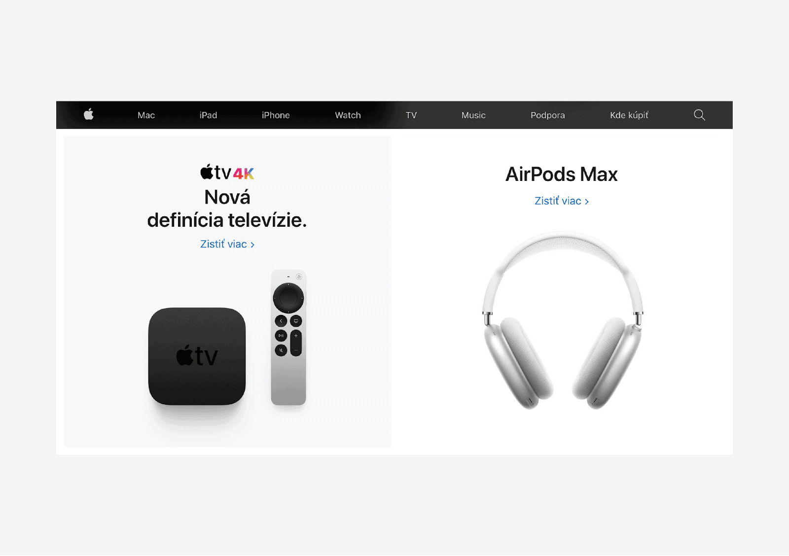
Practical advice - If the main menu contains expand items, it is always better to activate the expand menu items (mega menu) by hovering than by clicking on an item. However, it is always necessary to think about possible mouse movements. It often happens that users unintentionally expand different items than the ones they wanted.
Sticky header
A sticky header is commonly used to bring the header (primary sections with navigation elements) to the user’s attention. This header is always in the same location and is visible even while scrolling the page. This allows quick access to navigation and search elements without the need to scroll to the top of the page. It increases the probability that users will use these elements and view more products.
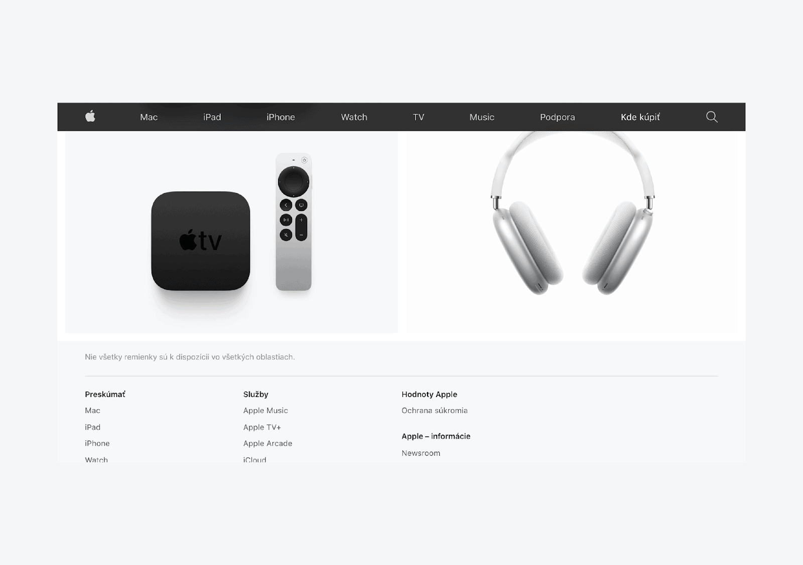
Practical advice - An even better version of the standard sticky header is a semi-sticky header, which (again) appears on the top of the page only when the user starts scrolling up. It provides more space for viewing content (especially on mobile devices) and shows the needed tools easily when users need them.
Home page and logo
One of the few things users can rely on is that every website has the home (start) page, which is perceived as the main starting point that provides information and an introduction to what the user finds on the site. Finding this information is particularly significant for visitors who enter the website from organic search or advertising and go directly to other pages at a lower level. Then they usually want to visit the home page to find out what they can see on the website and what types of pages are there.
If you start tracking user behavior, you will find that they often return to the home page when they get lost, have finished browsing the site, or are interested in more information about the store.
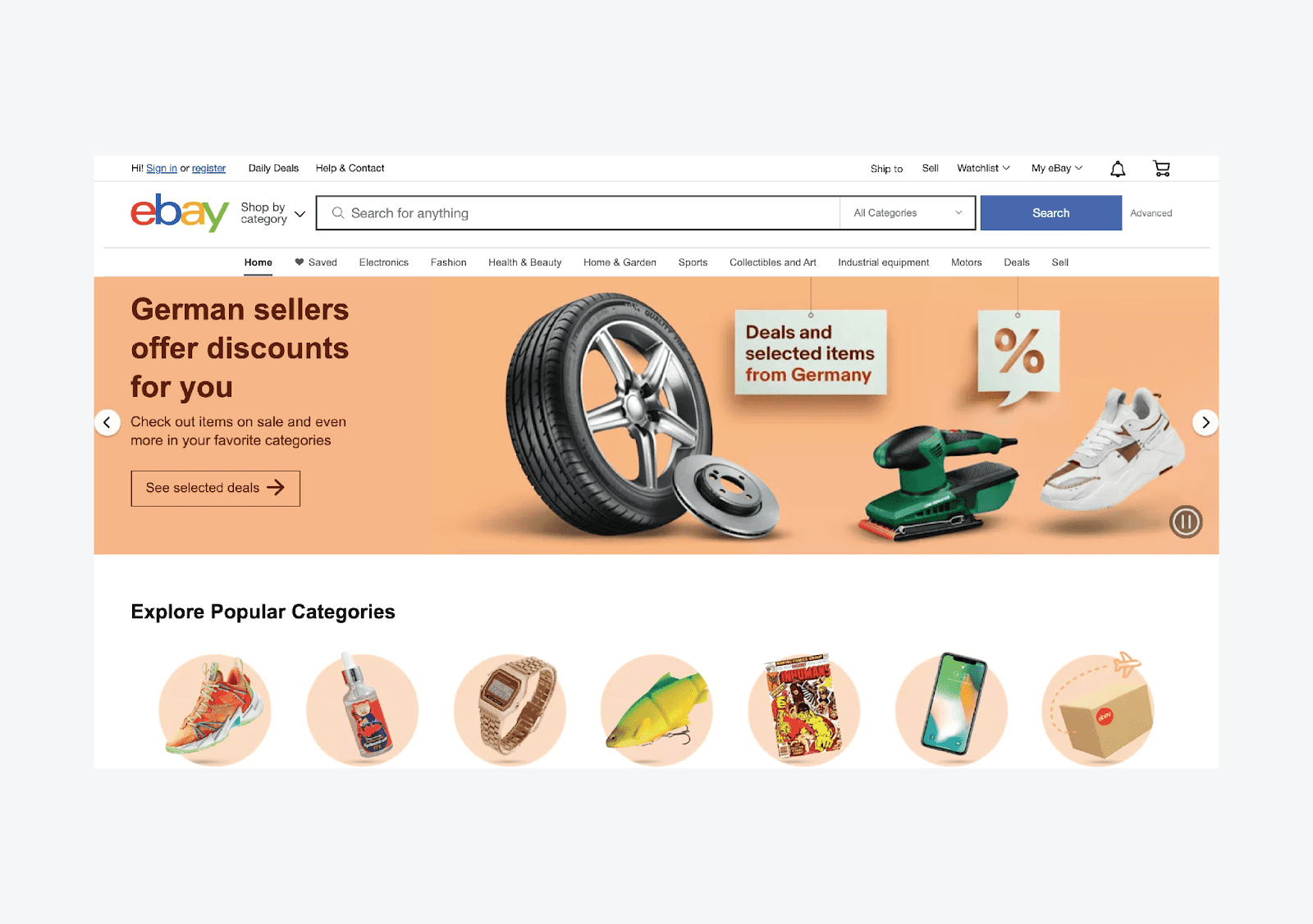
Practical advice - When designing a navigation, it is important to focus primarily on the audience and not on yourself. Most designers may find it obvious that the logo is clickable, and they don't feel the need to add a text link to the home page because it seems redundant and unnecessary to them.
However, the website or an online store is designed for a wide audience. Do they all have the same technological knowledge? Providing an additional item labeled "Home" will make it easier for many users to quickly find what they need.
Sidebar
Depending on the type of primary content, it is located on the left or right side of the page. The sidebar is often used to support the main navigation. When the user goes to the top-level category, in the sidebar they will see its subcategories.
Navigation elements in the sidebar are an excellent solution for online stores or websites with a demanding amount of information that needs to be structured. In addition to subcategories, the sidebar provides enough space for product filters.
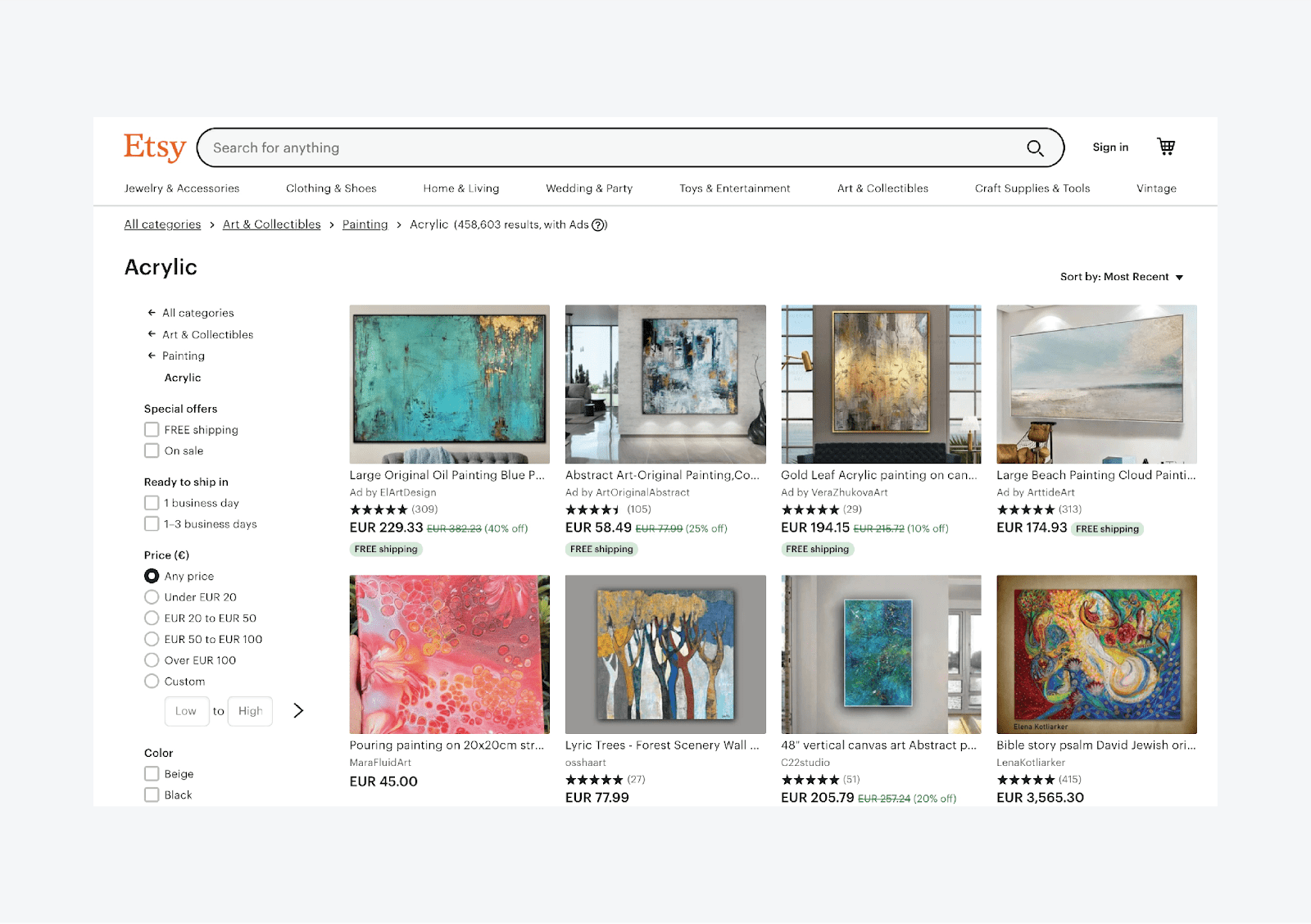
Practical advice - When tracking user behavior in an online store (e.g., by tracking mouse movements), you would probably notice that users tend to use the arrow back in the browser instead of just going back to the parent category. You can use this knowledge and place your own arrow back into the sidebar with subcategories to make browsing your page easier for the customers.
Page footer
The bottom of each website or online store is called a footer. Depending on the type of content, they tend to have different forms. However, this useful space is often underestimated already when planning the website design. We assume that users don’t pay much attention to the bottom of the page. The truth is, however, they actually do. This element, therefore, often does not fulfill its potential. If a user gets to the end of your site, they are probably interested in your content.
For example, users usually either visit the page footer when they are done with their visit (reading the article or searching for more content), or they scroll to the footer intentionally because they expect some specific information, such as contact details.

Practical advice - A footer is a universal place for communicating almost any content. You can use it to display more subcategories that can be relevant to a particular group of users. For example career information, partner content, information for media, etc. However, it is important that this content is really relevant.
Breadcrumb navigation
Breadcrumbs navigation (breadcrumbs) is a set of hierarchically arranged navigation links that appear at the top of the page, mostly directly below the main navigation. Breadcrumb navigation is a typical navigation element for online stores. It is one of the few navigation elements that indicate the user’s current position on the website.
Breadcrumbs are an important navigation element for all users. However, if we were to narrow down this group, we would focus primarily on users who have come to the website differently than through the homepage (organic search, ads, shared links) or used on-site search in the online store.
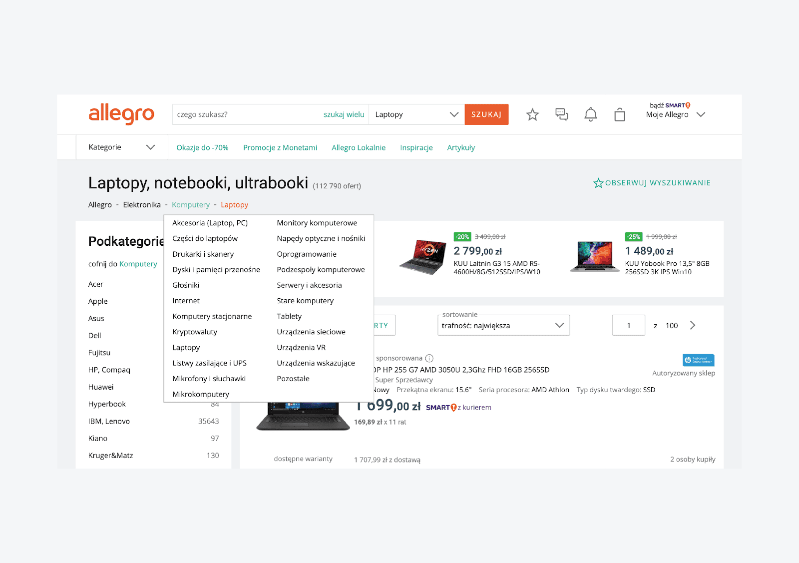
Practical advice - Breadcrumb tells us exactly where and how deep we are in the website structure. Individual items in the breadcrumb navigation must always be clickable and provide an option to follow the website hierarchy. If you want to improve the user experience, allow the users to view other categories on the same hierarchy level. This gives them more possibilities to discover new content.
Buttons and links
Buttons and hyperlinks are common navigation elements that the user encounters everywhere. The question, however, remains if we know which ones to use and when to use them. Buttons usually define clear actions that carry the user around the website or they lead them to achieve a specific goal (conversion).
We could simplify it and say that buttons define actions, that somehow affect the website itself or the online store. For example: Creating a user account, sending an order, confirming a transaction, etc. On the contrary, links are used for less significant actions that do not affect the behavior of the site and primarily perform a navigation task.

Practical advice - How we use buttons and links fundamentally affects the user experience. It is important to note that even when designing buttons and links, we work with a specific hierarchy of their display and basic rules that should be met.
- A button must always look like a button. It has to carry a clear call to action in the form of a text surrounded by a sufficiently large frame. Buttons often as well contain icons that reflect the action taken.
- Be consistent. Buttons and links that perform the same task must look the same everywhere on the page.
- Never use the same-looking buttons for different actions. If you need multiple buttons next to each other, highlight their importance and hierarchy. For example, the standard button refers to a primary action, a text button with a frame (usually referred to as a “ghost button”) represents a secondary action, and the text link is just the third option.
- The color and name of the button (actions taken) have an eternal impact on the user experience. That is especially true in the case of yes/no decision-making. For example:
“Changes you have made cannot be undone. Do you want to continue?” Options to “cancel” or “close” would confuse the user, who will not be able to decide which action is the correct one. However, if you use a red button with the text “Discard all changes” and a green button with the text “Continue with changes”, it will be clear already based on the colors.
- Hyperlinks are among the most naturally used navigation elements on websites. However, in order to maintain their usability, at least the following two conditions should be met: links should always be clearly visually separated from the other content (for example with color) and should always be underlined.
Navigation menu
Search vs. navigation menu
We could say that besides the navigation menu, search is one of the most important navigation elements and therefore deserves attention. However, the question remains:
“Why and when do users prefer to use the search over the navigation menu?”
In general, users are likely to prefer to search over the navigation menu if they know that a website or an online store can meet their needs with a sufficiently extensive offer. Simply put, if they know that they can find the product or category they are interested in, in the store.
They expect that when they enter a search query, they will get the results that will bring them closer to their goal. Research shows that about 60% of users leave a website or an online store if they do not find what they are looking for.
The extent to which the user prefers to search over the navigation menu depends on various factors. However, it mostly depends on the type of user (visitor) and the website segment.
Impact of search on various segments
A typical example of search usage is the Books and Games segment, where only 20% of users (of a total 100% traffic in the online store) use the search function on average. Nevertheless, the search in this segment accounts for up to 45% of the turnover. Another category is the B2B segment, in which up to 92% of all purchases come from search.
If you are interested in the impact of the search on individual segments and how to optimize it to increase your sales, download our free study Search benchmarks & insights at luigisbox.com/research-and-reports
Search and users
If we focus only on the home page, we see that up to 40% of users in the overall traffic prefer to use the search over the navigation menu.
Whether a user who comes to the homepage decides to continue to avoid by giving or browsing the navigation menu depends on what type of user (customer) is involved.
Every user who visits the online store behaves differently and has different motivations. Fortunately, we can divide users into 3 main types of visitors to generalize this.
- Visitors focused on buying products. They know exactly which product they want and what properties and parameters it should have, and their only goal is to find the product as quickly as possible and order it. For this type of user, the efficient search and optimized purchasing process are the key moments.
- Researching visitors. These customers more or less know what they want. Their goal is to find out as much information as possible about the products and only then decide on their purchase. Their decision-making takes longer, but they often shift their focus on buying, and optimized search can influence their behavior.
- “Browsing” visitors. They often visit their favorite online shops to find out what’s new without the intention of buying. They are curious, like to view content and think about what they could buy in the future.
Fun-fact: Groups of visitors who tend to use the search have a specific behavior. Such users often prefer the search as a quick path to a specific category rather than to follow a more complex multi-level navigation.
However, users usually don’t know the exact category name, but they know what products it contains. Then they tend to use the search to get to any product detail (which is in the desired or a similar category) with the intention of finding the needed product through breadcrumbs.
Practical advice - Search is not only a design element but has a significant impact on meeting the user's needs. In order for a search to be possible by an equivalent or more efficient navigation element than a navigation menu, it shall meet at least the following conditions:
- The search field must be readily accessible and always visible.
- It must be fast and responsive to any change in the query.
- Autocomplete should display results from the first character typed in.
- Search should automatically recognize typos, different word forms, and conjugation.
- Product variants should be displayed already in the autocomplete.
- It should recognize and recommend synonyms, and suggest phrases.
- It should cover the entire website content (products, categories, tags, text pages, articles, etc.).
- Relevant filters (facets) for the current result group should be available in the search results.
Why is the three-click rule a nonsense
The three-click rule suggests:
“Access to any page on a website should not take more than 3 clicks (or taps on the touch screen). Alternatively, the most important information should be accessible within 3 clicks.”
This rule assumes that users are frustrated and do not complete tasks that require more clicks.
However, it is an unofficial heuristic that is not supported by any data. Nevertheless, designers often apply this rule when creating website navigation, searching for information, filling in forms etc.
Counting clicks is not a meaningful metric for several reasons:
- The number of clicks needed depends not only on the design but also on the complexity of the task. Therefore, we cannot define a click as a specific absolute value.
- Not all clicks are the same, some may have longer waiting times, for example (if a new page is loaded), and others may be immediate (extending an accordion).
- The number of clicks does not affect user behavior. In the real world, users do not have to understand everything and often make mistakes. Thus, counting clicks loses meaning.
Practical advice - Many aspects of the design contribute to its usability, and by precisely dividing complex processes and tasks into multiple parts, you will reduce the mental burden on users and give them a much better and, above all, less frustrating experience.
How to design an efficient main navigation
It is important to understand that you can only start with the navigation design after creating a clear information architecture. It forms the basis for all navigation and navigation elements on the website or in the online store. All you need to focus on is to make it as usable as possible.
How to optimize the navigation menu
Do not hide navigation if you don’t have to.
When designing navigation, do not forget that users should always see what is most important to them. This simple rule applies not only to navigation, but also to other content.
When designing navigation, designers often want to save as much space as possible and tend to use responsive and mobile navigation elements such as the hamburger menu, even when it’s not necessary and risk that users will not use the navigation at all. We have to keep in mind that users cannot use what they don’t see. If we hide the navigation, we just lengthen and complicate their journey.
Place navigation and navigation elements there, where users expect them.
Users often assume a place to find navigation. Make browsing easier for them and place elements on their expected place – in the header, sidebar or the footer.
Visually separate navigation from the content
Navigation should not look like the rest of the content, it should be separated and stand out. Use white spots, play with typography and, of course, use color. The aim is to clearly define where navigation begins and ends.
Avoid styling items into the button design
The buttons have their specific function, which we have already discussed. The use of buttons as navigation items disrupts the hierarchy of navigation elements on the page and makes the overall readability of the navigation worse.
Use clear and descriptive item names
The names of navigation items can influence the user’s decision-making when browsing a website. The names must be unambiguous, unmistakable and concise. They must exactly name the destination, where they lead and, above all, use an understandable language. When designing the names of information architecture and navigation items, you will often need to be able to make the right decisions.
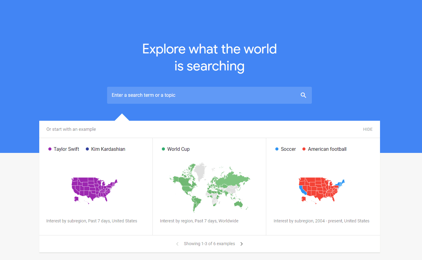
Practical advice - If you have an online shop with clothing, how you should name one of the main product categories: shoes, footwear, or footgear? Google keyword planner and Google trends will help you in your decision-making. Thanks to these tools, you will find that the right choice is the name of the category of Shoes. These tools will help you find relevant names for your target audience.
Practical advice - Online stores often have categories with different content but the same name. A typical example is a category named “PlayStation 5”. This category may be displayed in different places, for example, as a subcategory of the console section but also for games and accessories.
Such category names may have a negative impact if you don't have a precisely optimized search. For example, if the query "PlayStation 5" returns three times the same category, but with different content. Similarly, it may confuse the user, if they enter one of the categories from a different place than a home page, e.g., from a Google search or ads.
Although they see the page or category with the correct name, they might not be happy with its content.
Limit the number of top-level items
Limit the number of top-level navigation items to as few as possible. Market studies often mention the magic number seven as an ideal option (max. nine). Another approach to determine the maximum number of top-level items is that they should take up only 50-70% of space on the website. The rest should be reserved for seasonal products, promotions, or new products.

Website navigation should minimize the need of interaction, i.e., the effort that users have to make when interacting with the website. There are two good reasons to limit the number of top-level items in navigation:
- It will allow the users to understand the navigation interface better. The more navigation items you have, the more difficult the information for users is to remember and process.
- Simple and clear navigation with fewer items has a positive impact on search engine optimization.
Practical advice - When designing navigation and selecting its top-level items, you should consider the habits and needs of the website users. For example, allowing them to access the home page from any part on the website by clicking on the logo.
However, as I have already mentioned, not every user expects to reach the home page after clicking on the logo, so it is advisable to add an item called “Home” to the main navigation. Contact information is another essential navigation item and is often one of the most visited pages.
Visitors usually use it to verify the credibility of a business or a company, to find out where it is based, whether there are brick-and-mortar shops and whether they are, for example, close to them.
Keep the structure concise
Not only the number of items in the navigation but also their order is crucial. When designing navigation, it makes sense to sort the items by priority. Go from the highest up to the lowest priority. However, also take into account the Serial-position effect, according to which the most efficient items are those found at the beginning and end (our brain can handle them better than the items in the middle of the navigation). Therefore, items at the beginning and the end of the navigation become more significant for the users.
Do not forget about the search
Search is one of the most important navigation elements. Users expect it to be located just near the main navigation, where it serves as a secondary navigation element. If you hide or place the search inconveniently, you may lose a significant part of the revenues. Up to 40% of visitors use the search on the home page, and those are mostly users, who know what they want and are determined to buy.
Do not use drop-down menus
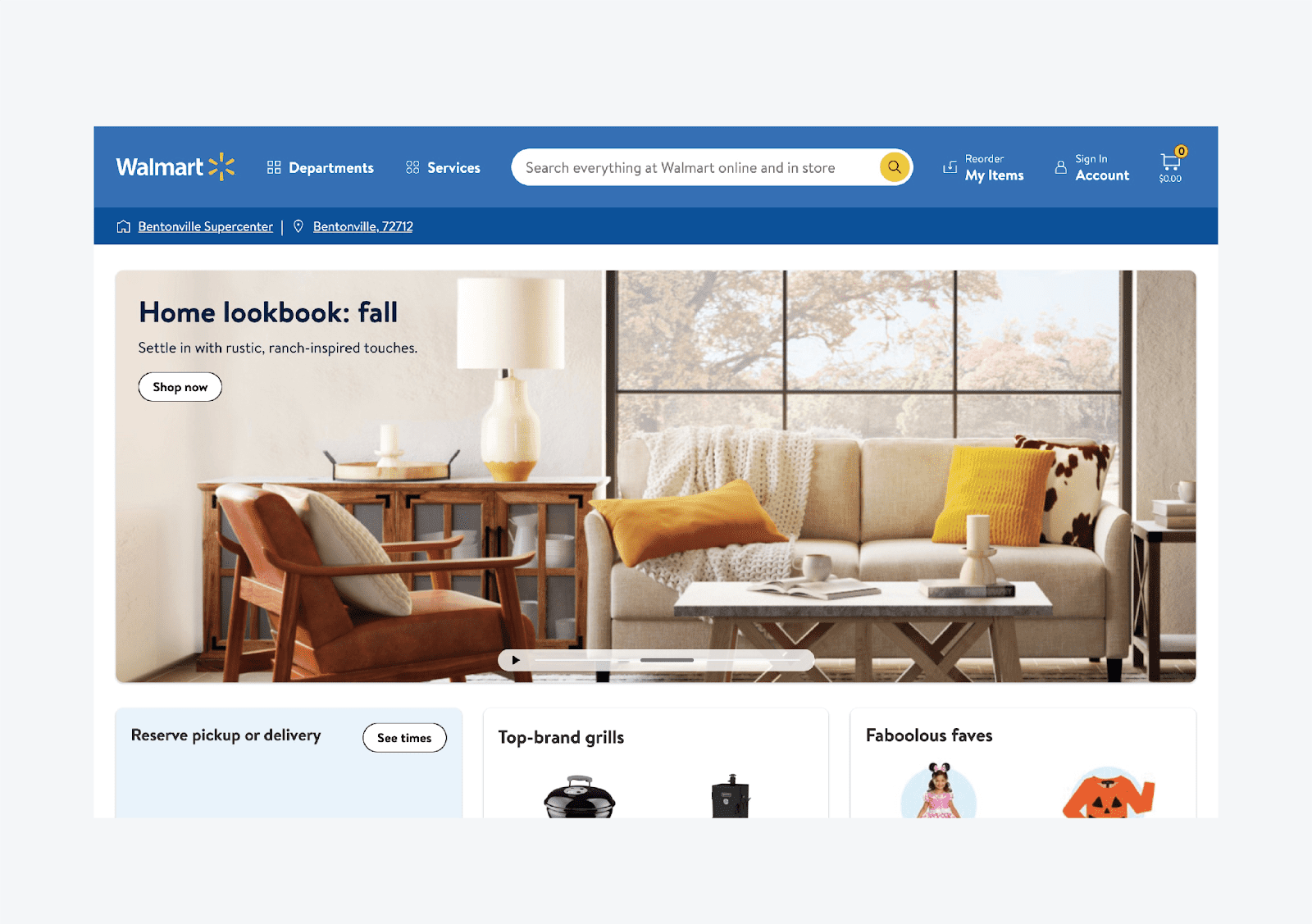
Drop-down menus are an unfortunate solution for displaying lower-level subitems in the navigation menu. Mainly because the number of items usually rapidly changes and grows quickly. Then it often happens that items do not display properly (they simply do not fit on the screen.) Another drawback of drop-down menus is that they do not allow convenient browsing of additional sublevels.
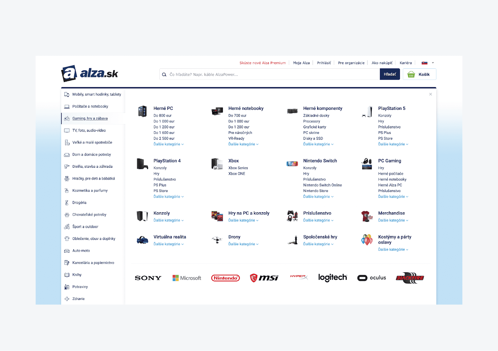
Practical advice - A standard and effective solution is the mega menu – large navigation bar, which appears after hovering the mouse above the main navigation item.
It is a great "design" option, if you need to place a large number of items in the product categories’ structure, or to display more lower-level subpages.
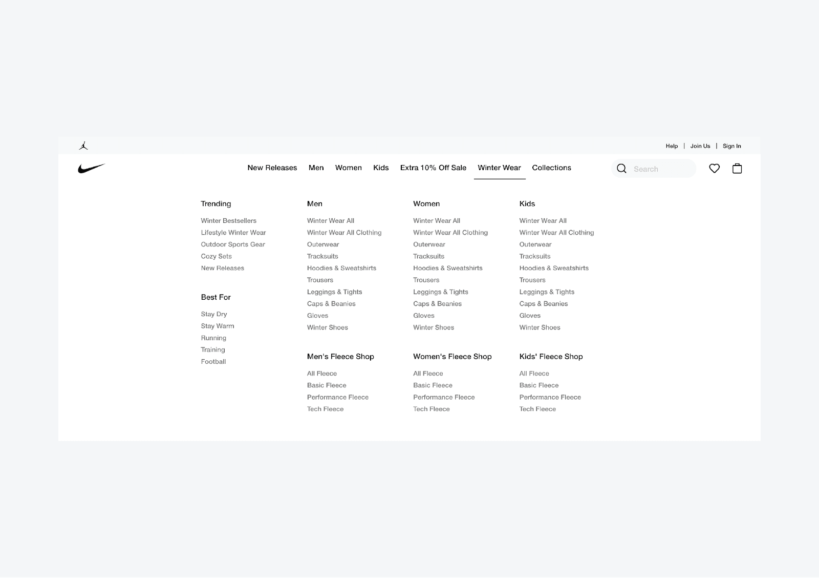
Such a layout also allows you to use space more efficiently, for example, to display products or ads, and improves the user experience (more space for items, a clear structure and hierarchy).
Analyze how users are browsing menu items
The navigation design process does not end with its implementation. It is crucial to validate whether the designed navigation is handy for users. You can only do this by following their behavior using various tools and methods.
Even before implementation, you can verify the functionality of the designed navigation using a Card sorting method or simple tree testing.
One of the most common tools is Google Analytics (Behavior/Behavior Flow section).

Users’ interaction with navigation can be evaluated efficiently using tools such as Hotjar, Smartlook or Clarity. These tools allow you to collect both quantitative (page clicks, mouse movement or scrolling) and qualitative data (video recordings). Based on these tools and methodologies, you can effectively help to improve the current status of your navigation and its structure and take further steps to improve it. For example, change the order of items in the main level, edit their names, etc.
For any analysis, it is good to use more methods and not rely on outputs from only one source. None of them may be as accurate as you would expect and none of them will tell you why users behave the way they behave (you can learn the consequences, but not the cause).
Do not optimize the menu based on the home page only
By default, the homepage represents about 30% of the overall visits to the website or the online store. The remaining 70% of traffic is made up of other sites that users get to, for example, organic search, advertising, social networks, etc. Therefore, it is important that the navigation is intuitive on every subpage. The easiest way to achieve this is to identify the most popular sub-pages, for example, using Google Analytics and optimize navigation by user behavior on them.
Responsive mobile navigation menu
There are already proven patterns and standards for responsive mobile navigation. They can be summarized in two words: “hamburger icon”. It is an icon consisting of three short horizontal lines representing the main menu. By default, it appears in the mobile website’s top right corner and clicking on it will display the navigation menu.
Even though the burger icon has become the dominant standard, adding the word “Menu” is still helping users to navigate and understand the meaning of this hidden navigation better.
Designers often use the mobile menu unnecessarily, trying to keep the design as responsive as possible. The key is to keep the essential navigation items present as long as possible and not be afraid to combine them with the burger menu.
For example, you can keep the search box displayed, and display the CTA button for the most important action, and some other items, such as contact information, can stay hidden in the mobile menu. Make sure that the phone number in the mobile view changes into a clickable text.
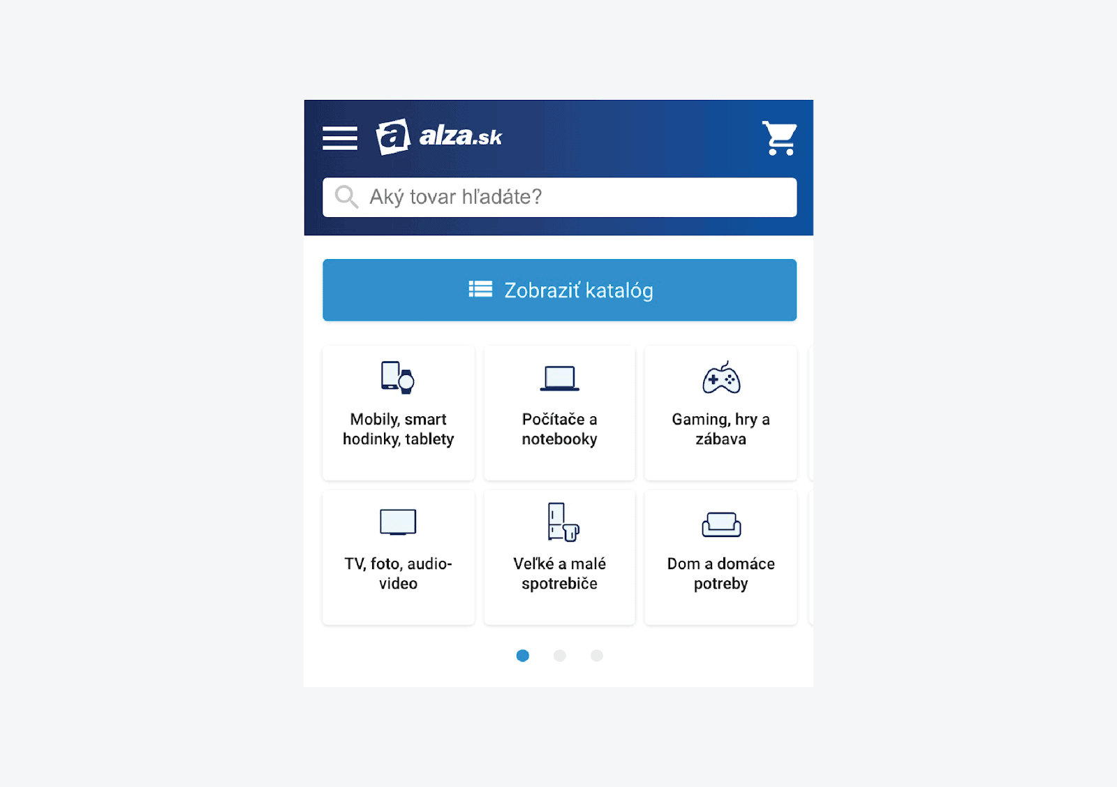
Practical advice - Make sure that the mobile version of your website:
- Has sufficiently big navigation elements, which are easy to tap. Easy-to-tap items should be at least 9 square mm wide. Areas that are big are usually comfortable for most users.
- All labels and texts should be well-readable. 16-pixel text size should be sufficient in most cases – that is a standard setting. In the case of smaller font sizes, you risk worsening the user experience.
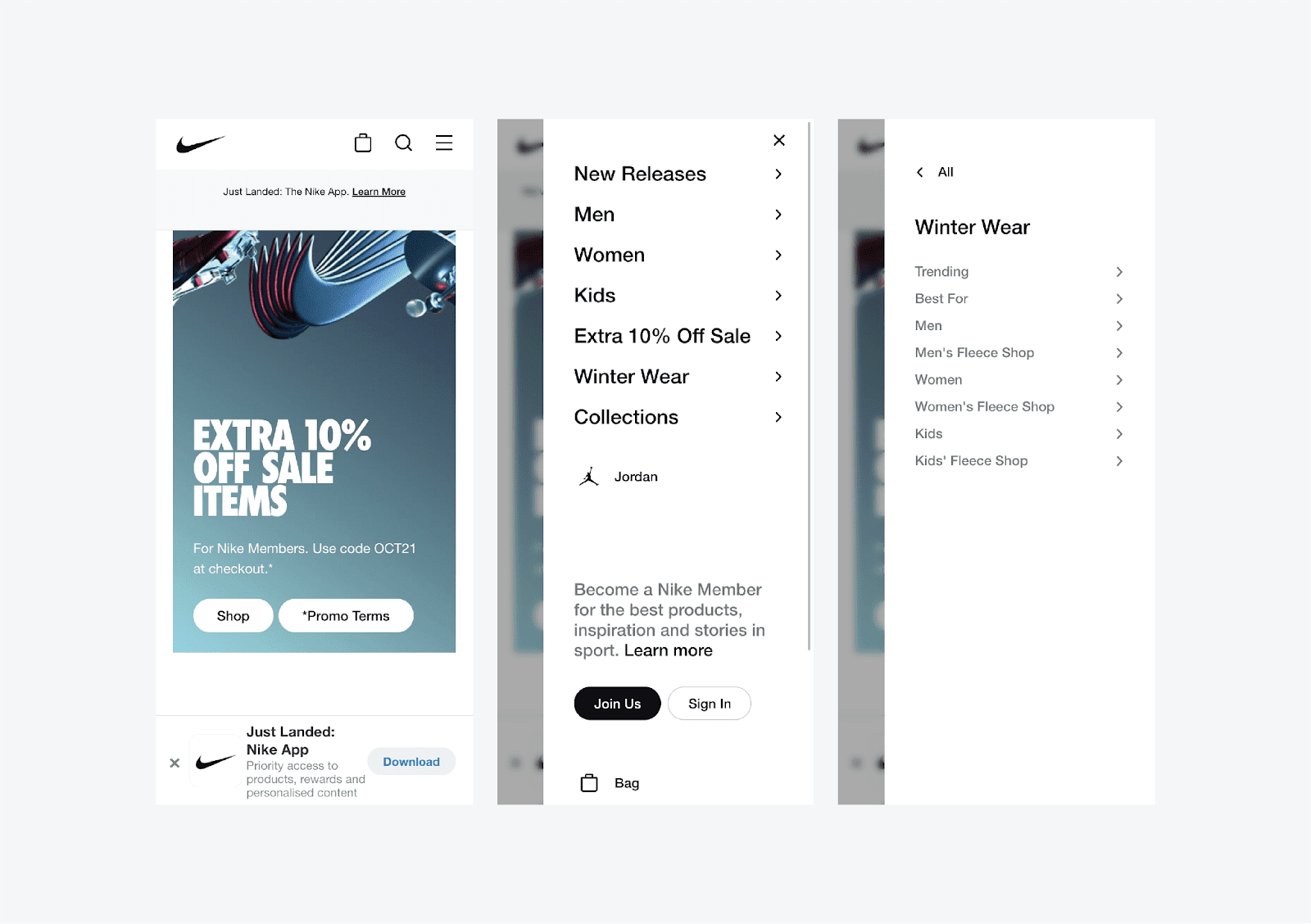
Options in the hamburger menu depend on the type and complexity of the website. A simple menu with the displayed items is sufficient on an ordinary presentation website. On websites with a lot of content and information or online stores, even the hamburger menu can be more complex.
It is structured, usually contains drop-down items to show lower levels, and is often used in combination with other mobile navigation elements.
A typical mobile navigation element, which complements the hamburger menu, is the bottom navigation bar.
This bar appears at the bottom of the screen and contains key navigation items or buttons. In online stores, it may be a shopping cart, favorite products, and more.
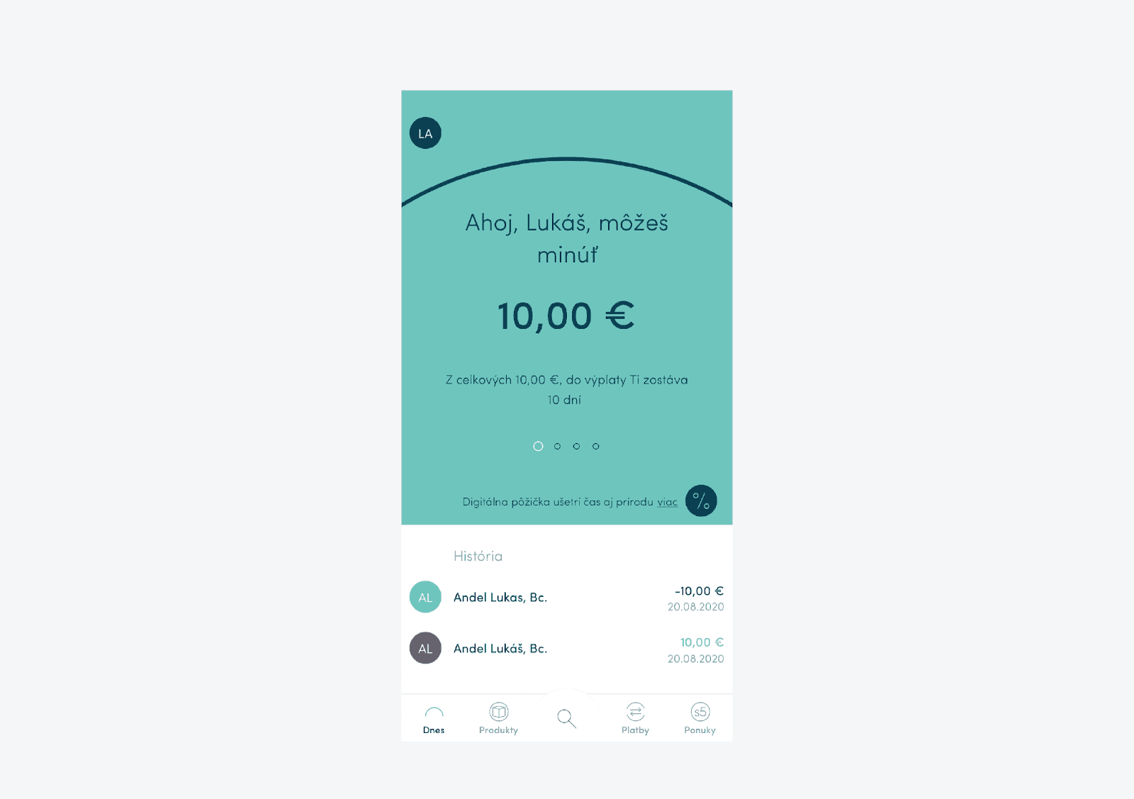
On websites or apps, these are the items for frequently and repeatedly performed actions (such as account movements or sending money in a banking application).
Conclusion
Navigation should be usable in the first place. Just then, creative. Try to follow the guiding principles described above, and your customers will always find what they need. Usability and clarity are priorities that will remain the same in the future.
Lukáš is a senior UX designer in Luigi’s Box with over a decade of experience in web applications, e-commerce solutions, and marketing communication. He is a member of the Slovak User Experience Association (SUXA) and participates in the Humans of UX initiative and the organization of the Slovak World Usability Day.
More blog posts from this author


